
JAPANESE DRIFT MASTER
JDM: Japanese Drift Master is an homage to Japan, Japanese street racing culture and drift. It’s an open world, story-driven experience, blending Tōge (mountainous) serpentines, with narrow rural roads and vast highways leading to a modern cityscape. With licensed cars and robust tuning options it’s a drifting paradise come true!
ROLE: UI/UX DESIGNER
User Interface Design, User Experience Design, Creation of widgets
SOFTWARE
• Figma
• Photoshop
• Unreal Engine
Design preview


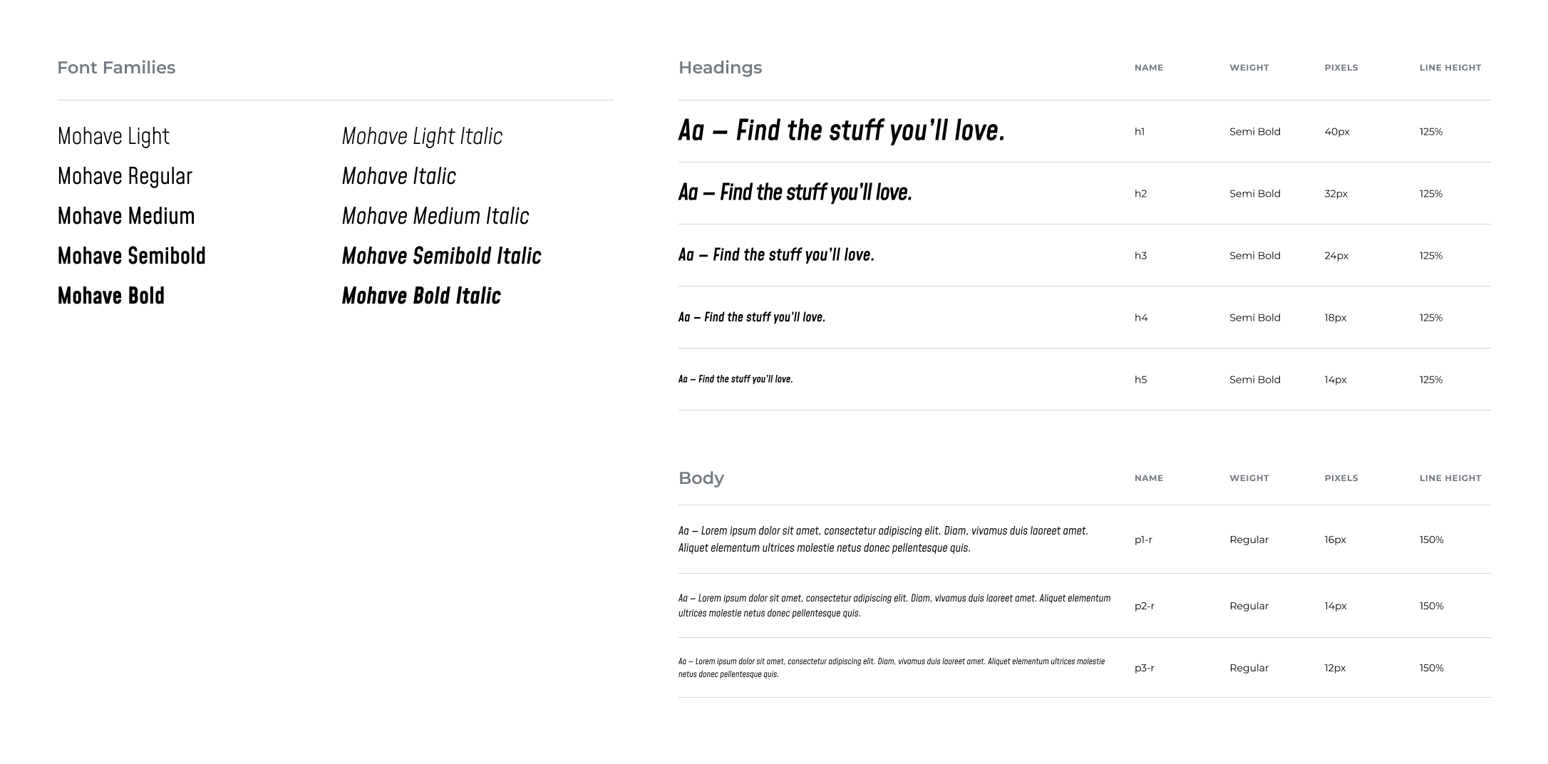
Typesystem design
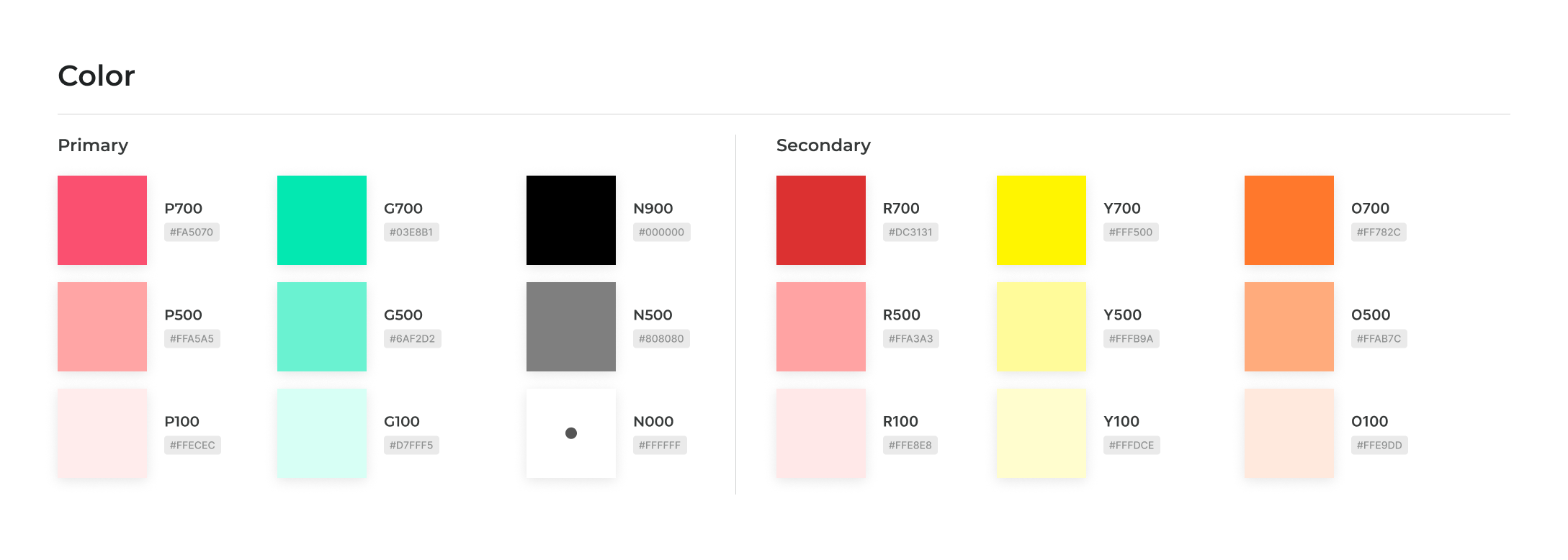
Color palette
PROBLEMS
• IMPROVING CLARITY IN CRITICAL POINTS OF THE USER EXPERIENCE:
Drawing on the experiences of players of the free prologue (JDM: Rise of the Scorpion – which I had a pleasure to design) from around the world, we identified critical pain points that required improvement. Our primary goal was to enhance their experience and create elements that would be even simpler and more intuitive to use.
• IMPROVING VISUAL ELEMENTS AT CRITICAL POINTS:
After evaluating the prologue build, I noted several UI elements that could be iterated on to ensure a more intuitive and polished user experience.
SOLUTIONS
After thoroughly reviewing the experiences of players of the prologue, we were able to clearly identify the project’s critical weak points. To meet player expectations, I took a closer look at the menu responsible for control customization, including the various steering wheel models supported by the game. The goal was to create a new version of the widgets that would enable clear testing and assignment of buttons to specific actions. This proved to be a challenging task requiring extensive testing and iteration – through which we ultimately arrived at a solution that is both intuitive and easy for players to understand. Additionally, several in-game widgets greatly benefited from being clarified and redesigned, including improvements such as increased contrast and a more appropriate choice of colors.
ITERATIONS OF BUTTON-ASIGNMENT PROCESS AND WIDGET
- Steering settings flow with innitial designs.
- The previous design proved too overwhelming for the average user, so I introduced a “Quick Binding” menu to streamline the configuration process and make it more accessible for players.

- The Quick Binding widget proved highly effective – it allowed users who didn’t want to spend much time on configuration to set up the basic functions and jump straight into the game. However, playtests revealed one drawback: the feature wasn’t sufficiently visible and often went unnoticed. Once players were made aware of its presence, though, they consistently described it as helpful.
- The previous design had another issue: the right-side panel (Input Tests) interacted directly with the binding menu. As a result, when a user tried to test the “A” button on a gamepad, it triggered edit mode and forced the user to change the binding unintentionally. To solve this, I introduced a hint-button that activated a dedicated “Test Mode,” isolating the test window from the binding system – effectively eliminating the problem.

- Playtests revealed that players still struggled to locate the Quick Binding menu. To address this, I approached the problem from a different angle. Test sessions also showed that users naturally looked for this feature within the “Advanced Binding” menu, which suggested that the core issue was visibility rather than placement.
- To improve discoverability, I increased the visual contrast to make the Quick Binding button stand out more. We also introduced subcategories within the binding system, allowing players to navigate more intuitively and quickly find the actions they were looking for (e.g., basic menu controls, driving, etc.).

- Another issue emerged during testing: players overlooked the “Devices” section, which caused confusion when interpreting the icons shown in the bindings. Since users typically read from left to right – and the widget displaying connected devices serves as the entry point to the binding process – I decided to move it to the left side for better visibility.
- We also observed that players tended to ignore the Input Test window on the right, so we removed it and replaced it with a dedicated hint-button, allowing users to access testing functionality only when needed.

- We were close to the final iteration, but the last round of playtests revealed that some players searched for the Quick Bindings feature both in the Advanced Bindings menu and in the previous menu. The group was large enough to draw clear conclusions – over 80% of participants looked for the option in both locations.
- Based on these findings, we restored the tile in the previous menu while keeping the Quick Binding entry inside the Advanced Bindings menu. To help players connect these two paths, we introduced a consistent, distinguishing color to unify them visually.
- Playtests also showed that users focus first on movement and video elements, then on imagery, and only last on plain text. Because of this behavior, we brought back the Input Test panel – now placed in the bottom-left corner and in a more compact form. The presence of active button prompts naturally drew players’ attention to the widget. We added a hint-button directly in the widget’s header to highlight the option of switching to the full Input Test view when needed.
